
I've never used nor seen 1.7. Aiz does of course haha. But if you could explain to me a bit more what this was?[TLDT]Amsterda wrote:Can't really think of anything that wasn't already said except please bring back preset lighting 3 from obs UI 1.7.
UI 3.0 Design Suggestions
Re: UI 3.0 Design Suggestions
-

 [TLDT]Amsterda
 - Dragoon
- Posts: 364
- Joined: Aug 18, 2019
- ESO: Amsterda
Re: UI 3.0 Design Suggestions
Well I hope Aiz still has the lightsets, basically UI 1.7 featured 4 preset lightings for the map besides the default one that you could switch between during game. Don't really think I could describe the lightsets themselves since I only vaguely remember them at this point but I could install the UI and see if I can get an obs game started with it to showcase the lightset.Kao wrote:I've never used nor seen 1.7. Aiz does of course haha. But if you could explain to me a bit more what this was?[TLDT]Amsterda wrote:Can't really think of anything that wasn't already said except please bring back preset lighting 3 from obs UI 1.7.
-

 Riotcoke
 - Retired Contributor
- Posts: 4088
- Joined: May 7, 2019
- ESO: Riotcoke
- Location: Dorsetshire
- Clan: UwU

Re: UI 3.0 Design Suggestions
You can actually set your own light level with the console while using the UI, maybe have a go and try and find what you remember it to be @[TLDT]Amsterda

twitch.tv/stangoesdeepTV
Re: UI 3.0 Design Suggestions
Okay I understood enough of the request, I just wonder why Aiz removed it. There might be a reason, depending on it we'll see if we can bring this back.[TLDT]Amsterda wrote:Well I hope Aiz still has the lightsets, basically UI 1.7 featured 4 preset lightings for the map besides the default one that you could switch between during game. Don't really think I could describe the lightsets themselves since I only vaguely remember them at this point but I could install the UI and see if I can get an obs game started with it to showcase the lightset.Kao wrote:I've never used nor seen 1.7. Aiz does of course haha. But if you could explain to me a bit more what this was?[TLDT]Amsterda wrote:Can't really think of anything that wasn't already said except please bring back preset lighting 3 from obs UI 1.7.


-
Riotcoke
- Retired Contributor
- Posts: 4088
- Joined: May 7, 2019
- ESO: Riotcoke
- Location: Dorsetshire
- Clan: UwU
Re: UI 3.0 Design Suggestions
Dunno if someone has said this before but one thing that would actually be insane would be auto updating scores.
twitch.tv/stangoesdeepTV
-
 Kaiserklein
 - Pro Player
- Posts: 10282
- Joined: Jun 6, 2015
- Location: Paris
- GameRanger ID: 5529322
Re: UI 3.0 Design Suggestions
Ah yeah I think that was mentioned a while ago. Would be great obviously, but not sure how possible it is considering the rehosts, people restarting their game, etc.


LoOk_tOm wrote:I have something in particular against Kaisar (GERMANY NOOB mercenary LAMME FOREVER) And the other people (noobs) like suck kaiser ... just this ..
-

 musketeer925
 - Retired Contributor
- Posts: 2484
- Joined: Mar 28, 2015
- ESO: musketeer925
Re: UI 3.0 Design Suggestions
For reshosts, "don't count score if game time less than 5 minutes" seems like a rule that would cover 90% of cases, as long as the UI had a option to adjust manually for exceptional cases.Kaiserklein wrote:Ah yeah I think that was mentioned a while ago. Would be great obviously, but not sure how possible it is considering the rehosts, people restarting their game, etc.
As far as game restarts go, I think it may be able to persist data across restarts. Reset score if the players change.
-
 Interjection
 - Howdah
- Posts: 1045
- Joined: Mar 15, 2015
- ESO: Interjection
- Location: United Kingdom

Re: UI 3.0 Design Suggestions

I got excited and started making something. This is just some random ideas, I'm pretty sure there's better ways of laying things out. It's also not finished, I think where the techs are shown in the bottom right... that should show all techs complete including stuff like 'cav combat'. When you click a unit, it will show the relevant techs. I imagine the market techs being grouped together so it's easy to spot them.
-
musketeer925
- Retired Contributor
- Posts: 2484
- Joined: Mar 28, 2015
- ESO: musketeer925
Re: UI 3.0 Design Suggestions
I like the way the bottom panel is much better in interjection's suggestion here. I am not a fan of the queues in the top left, it's hard to tell whose is whose. I'd rather see the bottom UI a little taller if it mean queues could fit there.
-
musketeer925
- Retired Contributor
- Posts: 2484
- Joined: Mar 28, 2015
- ESO: musketeer925
Re: UI 3.0 Design Suggestions
Another thought: it'd be really nice to be able to see "units killed in last minute" or something like that. This would really help with looking at raids.
I was also thinking a bit about more high-level "modes" a caster could toggle between, showing important things for that situation. Things like "battle", "raid", "boom/economy", that capture extra info about particular situations. Toggling between the current drop-downs during a game is too hard to do on the fly. Intejection might have ideas about what kinds of categories and what should be shown in each.
I was also thinking a bit about more high-level "modes" a caster could toggle between, showing important things for that situation. Things like "battle", "raid", "boom/economy", that capture extra info about particular situations. Toggling between the current drop-downs during a game is too hard to do on the fly. Intejection might have ideas about what kinds of categories and what should be shown in each.


Re: UI 3.0 Design Suggestions
That’s super helpful and exactly what we’re looking for!Interjection wrote:
I got excited and started making something. This is just some random ideas, I'm pretty sure there's better ways of laying things out. It's also not finished, I think where the techs are shown in the bottom right... that should show all techs complete including stuff like 'cav combat'. When you click a unit, it will show the relevant techs. I imagine the market techs being grouped together so it's easy to spot them.
What about the eco milit pop bar? How might you redesign it?
oranges.
-
Interjection
- Howdah
- Posts: 1045
- Joined: Mar 15, 2015
- ESO: Interjection
- Location: United Kingdom
Re: UI 3.0 Design Suggestions
Think of this as some random ideas, I can put something more definitive together soon. I'd like to be involved in the dev process if you'll have me on board
@musketeer925 I'm also starting to think the bottom panel showing 'all units' should home the techs being researched and units & buildings in queue
@musketeer925 I'm also starting to think the bottom panel showing 'all units' should home the techs being researched and units & buildings in queue


Re: UI 3.0 Design Suggestions
I think you would just move teal's queue over to the right honestly. Putting any more down the bottom would become a bit too much asso you don't want to make the screen so it is a long thin rectangle to look at the actual gameplay. It would be hard to watch for flanks with armies etc.musketeer925 wrote:I like the way the bottom panel is much better in interjection's suggestion here. I am not a fan of the queues in the top left, it's hard to tell whose is whose. I'd rather see the bottom UI a little taller if it mean queues could fit there.
“To love the journey is to accept no such end. I have found, through painful experience, that the most important step a person can take is always the next one.”


Re: UI 3.0 Design Suggestions
Having a universal queue like that on screen would be a tremendous improvement to the current UI, for sure. I don't really think you need to have the shipments sent on the bottom UI bar, though--you could simply include it in the universal queue.


Re: UI 3.0 Design Suggestions
My pet peeve with these UIs is how much screen they end up covering. The most important thing is actually seeing the gameplay, that's the top priority imo. Seeing info and data about the current state of the game is secondary. If you sacrifice gameplay vision for info/data, you're doing it wrong, imo.
Of course, you can try to reach a decent compromise between the two. I think I would cut down on the size of those bottom panels: the one that surrounds the minimap and the one that provides a background to selected unit info. They need to be at the same level as the main panel that displays player info.
The unit portrait is definitely not an essential item in the UI: it could be either taken out or resized to a tiny version of the current one. It takes way too much space that could be used in a better way. And if you lower all the items displayed in the main, central panel a bit and increase the height of the panel only slightly, you can accommodate all those items that are hanging out, on top of the panel (the dropdown menu that selects what is currently displayed and the camera control button).
The military pop and econ pop graphs could be assimilated into the top score bar, where players' names are displayed. A much slimmer, but still visible version of it could fit in there, imo.
I could whip out a Photoshoop mockup, if anyone's interested in these ideas.
-

 Mr_Bramboy
 - Retired Contributor
- Posts: 8219
- Joined: Feb 26, 2015
- ESO: [VOC] Bram
- Location: Amsterdam
Re: UI 3.0 Design Suggestions
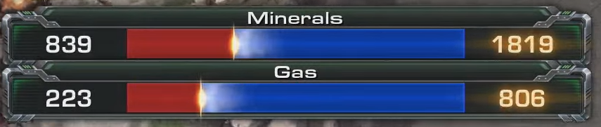
This is another thing from Starcraft that I would love to see. I'm not sure if it's been mentioned yet in this thread. Basically, the bar shows relative incomes. This could be a togglable button and it doesn't have to be on the screen the entire time.
-
 [Armag] diarouga
 - Ninja
- Posts: 12710
- Joined: Feb 26, 2015
- ESO: diarouga
- Location: France

Re: UI 3.0 Design Suggestions
Germany is the protoss of aoe3.
-

 Blastkiller
 - Dragoon
- Posts: 338
- Joined: Mar 4, 2019
- ESO: Blastkiller
- Location: Italy
Re: UI 3.0 Design Suggestions
beautiful, this thing I wanted to see is the topAizamk wrote:That’s super helpful and exactly what we’re looking for!Interjection wrote:
I got excited and started making something. This is just some random ideas, I'm pretty sure there's better ways of laying things out. It's also not finished, I think where the techs are shown in the bottom right... that should show all techs complete including stuff like 'cav combat'. When you click a unit, it will show the relevant techs. I imagine the market techs being grouped together so it's easy to spot them.
What about the eco milit pop bar? How might you redesign it?
No one will escape from me, from my Russians, neither a troll nor a hacker nor a smurf, they will all give days in front of my strelets
-
Blastkiller
- Dragoon
- Posts: 338
- Joined: Mar 4, 2019
- ESO: Blastkiller
- Location: Italy
Re: UI 3.0 Design Suggestions
the technologies of the market are okay type after developed leg nipples replace hunting dogs, I don't remember who had already proposed this idea
No one will escape from me, from my Russians, neither a troll nor a hacker nor a smurf, they will all give days in front of my strelets
-
Blastkiller
- Dragoon
- Posts: 338
- Joined: Mar 4, 2019
- ESO: Blastkiller
- Location: Italy
Re: UI 3.0 Design Suggestions
I was thinking that if you could make a category just for lost buildings, lost units, type of real-time statistics, resources collected, expenses, troop expenses, etc.
No one will escape from me, from my Russians, neither a troll nor a hacker nor a smurf, they will all give days in front of my strelets
-
 Sargsyan
 - Jaeger
- Posts: 3372
- Joined: Dec 18, 2017
- ESO: lamergamer
- Location: North Macedonia
- Clan: c0ns

Re: UI 3.0 Design Suggestions
think we can use the normal UI instead of the minimezed one to fit more info in there.
krichk wrote:For some reason, you want the world to know that you're brave enough to challenge Challenger_Marco

Re: UI 3.0 Design Suggestions
Please no, the screen is already rather crowded as is.
Tbh I wouldn't show units and buildings in queue. This is not something you want to see constantly, more situational imo.
Tbh I wouldn't show units and buildings in queue. This is not something you want to see constantly, more situational imo.
Re: UI 3.0 Design Suggestions
In fact we are doing the UI from scratch, so that's not a question of maximized versus minimized 
-
[Armag] diarouga
- Ninja
- Posts: 12710
- Joined: Feb 26, 2015
- ESO: diarouga
- Location: France
Re: UI 3.0 Design Suggestions
Buildings in queue don't really matter but being able to see the shipments otw and the units in queue is a good addition. Currently, the casters have to guess if a shipment is on the way or if some units are about to pop while it's game changing.
Who is online
Users browsing this forum: No registered users and 3 guests